Ever walked into a room and instantly felt relaxed, energized, or slightly "off"? It's not just the décor or lighting — it's the colors around you. Color psychology looks at how different shades can impact your mood and behavior, making it a game-changer when designing your space.
Colors don’t just add aesthetic appeal; they also impact our mood, productivity, and even sleep quality. Whether you're choosing wall paint, furniture, or décor accents, understanding the emotional effects of color can help you create an environment that supports your lifestyle.
How Different Colors Affect Mood
1. Serene and Soothing: Blues and Greens
-
Blue is often associated with tranquility and peace. Lighter shades, like sky blue, create a refreshing and airy atmosphere, making them ideal for bedrooms and bathrooms. Deeper blues, like navy, can evoke sophistication and stability.
-
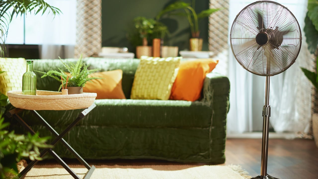
Green is linked to nature and renewal. It has a calming effect while promoting balance, making it an excellent choice for living rooms, home offices, or any space where relaxation is key.
2. Warm and Energizing: Reds and Oranges
-
Red is bold, passionate, and stimulating. While it can increase energy levels, too much red may feel overwhelming. Consider using it as an accent color in dining areas or social spaces to encourage conversation and warmth.
-
Orange is vibrant and uplifting. It can evoke excitement and creativity, making it a great choice for home gyms or creative workspaces.
3. Cozy and Comforting: Earthy Neutrals
-
Beige, taupe, and warm browns create a sense of grounding and warmth. These colors work well in living rooms and bedrooms, fostering relaxation and comfort.
-
Gray offers a sophisticated, modern feel. It can be calming in lighter tones or dramatic and moody in darker shades.
4. Cheerful and Uplifting: Yellows
-
Yellow is associated with happiness and optimism. Soft pastels can make a space feel bright and airy, while deeper mustard tones add warmth and coziness. It’s a great choice for kitchens or entryways where a welcoming feel is desired.
5. Elegant and Dramatic: Black and White
-
Black adds depth, sophistication, and drama. When used sparingly, it can create a luxurious and modern look.
-
White symbolizes cleanliness and simplicity. It makes a space feel open and airy but can sometimes feel sterile without contrasting textures or colors.
Tips for Choosing the Right Color Palette
-
Consider the room's function – Do you need a calming bedroom or an energizing workspace?
-
Think about natural light – Darker colors can make a small, dimly lit room feel smaller, while lighter hues open up a space.
-
Use color psychology to balance moods – If you love bold colors but don’t want them to overwhelm a space, use them as accents rather than dominant shades.
-
Test samples before committing – Colors can look different under various lighting conditions, so try swatches on your walls before making a final decision.
Your home’s color palette does more than just create a beautiful aesthetic — it directly influences how you feel and interact with your space. By choosing hues that align with your desired mood and energy, you can create an environment that supports relaxation, creativity, and well-being.